Case study · 2021 →
Explore.Porto.pt
The live transport network in one place, with the places worth visiting and exploring alongside it, so that getting around Porto without your own car is the easy choice. The city wanted fewer private cars in it, and this is the part of that a product can take.
At
Role
My part
Worked with
Status
How it started
The city already had the data. What it didn't have was a way for a resident or a visitor to turn it into a decision: which of the city's own ways of getting around to take, and when.
Porto Digital brought the brief as a public service goal rather than a feature list: fewer private cars in the city, by making everything else the city offers visible enough that a person can choose it. That goal belongs to the city, and no website delivers it on its own. Transport schedules, points of interest and street-level context lived in separate places, each with its own logic and its own owner. Nine organisations in all: two transport operators, five municipal departments, a city company, and Porto Digital itself, which sits beside the Câmara Municipal do Porto rather than inside it and ran the programme.
What the product would be held to was narrower: every way of crossing the city, live and in one place, so that leaving the car behind is the easier choice. A resident getting across the city and a visitor working out what to see are asking different questions, and the product answers both from the same place, in Portuguese or in English: what is running now, where it goes, what is worth stopping for, and what is on this week. One constraint came with the brief: the places come from the city's own open dataset, opening hours and descriptions included, maintained by the Câmara Municipal do Porto rather than aggregated from reviews and ratings. That is the difference between this and a travel app. The city owns the record, and the product's job is to make it usable to somebody standing in the street.
It started inside Porto Digital's own programme of city services rather than with a council target or a public complaint, which is how most work in a city actually begins. The data was published and the feeds existed. Porto Digital commissioned a service to put them in the hands of the people the city exists for: the ones who live in it, and the ones passing through.
Process
Framing the goal with the city
Before any screen: what does the city want people to be able to do, and what counts as success. Written down, agreed, and used later to settle arguments about scope.
Interviews with people in Porto
Residents with somewhere to be and visitors with an afternoon. Following how they actually plan a trip: the pauses, the second-guessing, the moment they give up and open a different app. The pains and the needs came out of those conversations, not out of a workshop.
What the city already had
An audit before a design: which data existed, which of it was actually available to us, and what was simply missing. Some of what people asked for could not be built yet. Knowing that early changed the plan instead of embarrassing it later.
One blueprint for the whole trip
Not a sitemap. A blueprint of the service end to end: what the person does, what the product shows them, and what has to happen behind it for that to be true. It is the document the rest of the project was argued against.
Prototypes, tested with two audiences
A clickable prototype for the route-and-transport flow, tested with real trips, and put in front of the stakeholders separately. Users changed the information order. Stakeholders changed what we agreed the first release had to carry.
Features, sequence, and what waited
A feature plan and a roadmap, built from the blueprint and the audit rather than from a wishlist. Two things waited, and the audit from step 03 is why. Themed routes, where you pick gastronomy and an afternoon and get back a plan with travel time counted in, needed a visit duration per place that the dataset did not carry. Live parking availability, so a driver could see where to leave the car before switching to transport, needed a live feed the city did not have. The second pointed most directly at the city goal and still could not ship.
Alongside the build, not after it
Front-end implementation with the engineers, and checking what got built against the blueprint as it landed. So the interface survived contact with the real data: schedules that shift, points of interest with uneven content.
Measured at launch, and again six months later
Analytics set up against the success definition from step 01, plus the interviews run again, once at release and once after the product had been running for half a year. A count tells you something happened; only a person tells you why. Reading twice is the step people skip, and it is the only way to tell a launch spike from a habit.
Decisions
Tradeoff 01
One plan, not one tab per mode
Bus and metro, scooters and bikes, taxi ranks, the places worth stopping at, the itineraries that string them together, and what is on this week all arrived as separate feeds. Nobody plans a trip in feeds. They ask one question, so the product had to answer it once, across whatever is actually running.
Tradeoff 02
Real-time only where it changes behaviour
The interviews asked for it everywhere. It earns its place where it changes the next thing you do: whether there is a scooter in that dock, a taxi at that rank, a bus due at that stop. On the overview it would only have made the page slower and the city noisier.
Tradeoff 03
Readable on a phone, in the street, in sunlight
Contrast and type size set for the worst case rather than the portfolio screenshot.
Tradeoff 04
The service goes to the street, not the app store
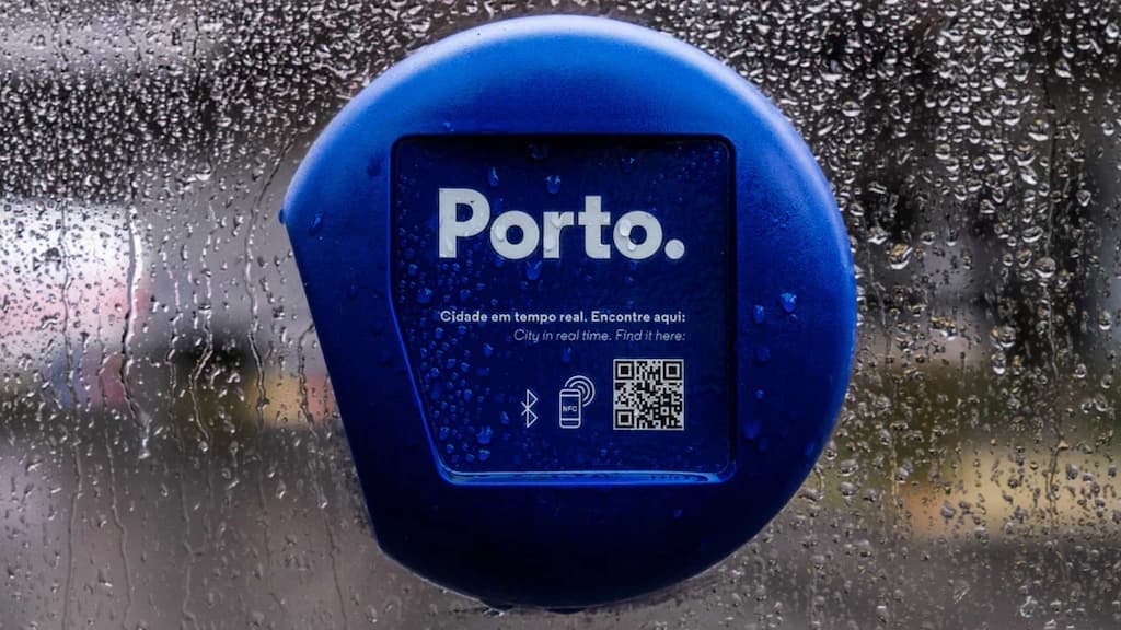
Beacons at bus stops and at the places themselves, each answering to a phone camera or an NFC tap and handing back a link to the service at that exact spot. Scan at a stop and you get the next arrivals and where they go. Tap at a museum and you land on that place, already open. It is a web app, so there is nothing to install, which also means every entry point has to load fast on a street connection and make sense with no history behind it.
Tradeoff 05
Built on the commons, not on a vendor
Community open source under it by choice, with contributing back part of the intent rather than an afterthought. That costs more integration work than buying a proprietary mapping and routing product, and it leaves no vendor to escalate to. What the city gets in return is a service it can keep, extend and hand to the next team without asking anyone permission.
The product
Outcome
The goal the city set was fewer private cars in Porto. No single product does that, and this one should not claim it. What it could be held to is narrower, and it shipped.
The whole network live in one place, for two audiences, in two languages, reachable from the street without installing anything.
Everything below is attributed, because the reading is not mine alone. It came out of user feedback before and after launch, the goal set with the city, the people who had to live with the decisions, and what the city has published since.
From the interviews
One thing came back more than anything else: there was nowhere to see the network running in real time. People named buses and metro together, as a single question, and then had to go to separate places to answer it. What they were asking for was not a better timetable. It was what is moving now.
Against the goal set with the city
The city states its own commitment publicly as a Porto that is more accessible, digital and intelligent, served by information that is useful, reliable and curated by the Município. The first release was held to the narrower half of that, and shipped it: every mode live in one place, the city's own places alongside them, reachable from the street without installing anything.
From tracking and repeat interviews
I tracked the service after release and went back to people at launch and again six months later. The QR codes were working as a real entry point: people were arriving at the service by scanning one in the street. What they described doing once they landed was the job it was built for, reading the timelines and working out the route to wherever they were actually going. Daily commuters and travellers both, which is the split the product had been designed around.
What the city did with it
In 2022 Porto Digital took the project to the smart city expo in Barcelona, presented as a sustainable and smart mobility service and framed against UN Sustainable Development Goal 11. A city choosing to show the work abroad is a different kind of evidence from a usage figure, and it is the city's judgement rather than mine.
Reported by Porto Digital
Writing in October 2025, Porto Digital put the platform at more than 4 million visits since launch, with monthly visits and users growing by more than 25% on average across 2025, reached through over 1,100 QR codes and beacons at bus stops, tourist sites and public spaces. Those are the city's figures for the service as it stands today, years of it built after I came off the project, not a reading of the release I worked on.
What this cannot show
Whether Porto has fewer cars in it. Fares, parking, new lines and habit all act on that, and this product is one input among them. The honest claim is a contribution to the goal, not the result.
The best of it was how short the loop was. The service was out in the street on the beacons, so you could stand at a stop, watch somebody scan one, and go and make the live data better the same week. The other half was the company: the scooter and bike operators, the taxi ranks, STCP and Metro do Porto, and departments across the city hall, each with their own systems and their own reasons for being there, all pulling towards one service for the people who live in Porto and the people who come to see it. Getting that many organisations to want the same outcome turned out to be rarer, and more useful, than getting them to agree on a specification.